
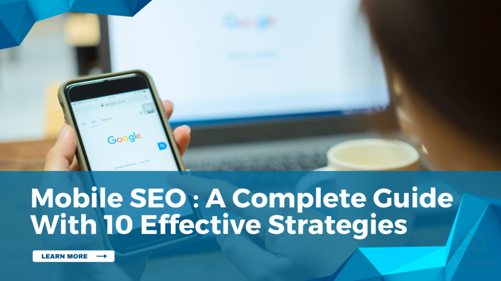
Mobile SEO : A Complete Guide With 10 Effective Strategies
Mobile usage has become the primary way people access websites today. Most searches now occur with the help of smartphones, and users want websites to be loaded quickly, have a clean look, and respond to the request easily. This shift has made Smartphone SEO one of the most important parts of modern website optimisation.
When websites follow Mobile Friendly SEO principles, they not only rank better but also keep visitors engaged. Below are 10 effective strategies to strengthen your website using proven Smartphone SEO techniques and practical examples.
1. Use a Responsive Website Design
A responsive webpage can automatically change its layout according to screen size. It makes the same page functional on phones, tablets, and desktops. Search engines strongly favour responsive design as a core Small-screen SEO best practice.
Responsive design also enhances the experience of the user by preventing zooming, scrolling, or broken layouts. It also makes maintenance easier and more uniform between devices.
Tips
- Always apply responsive themes or structures
- Test design across different smartphone screen sizes
Case Study
A business website in New York had strong desktop traffic but weak mobile engagement. Many visitors left within seconds of opening the website.
After switching to a responsive design, smartphone users stayed longer and explored more pages. The website’s overall rankings improved steadily.
2. Improve Mobile Page Loading Speed
Loading speed is critical for mobile users. Visitors become irritated with slow pages and leave immediately. Phone loading time is directly taken into account by Google when determining rankings.
Improving speed involves image compression, browser caching, lightweight code, and server optimisation. Faster pages improve both rankings and user satisfaction.
Tips
- Compress images before uploading
- Use caching and content delivery networks
Case Study
An e-commerce platform in California recorded that 53% of smartphone users left if pages took longer than three seconds to load. Their mobile sales were declining despite high traffic.
After optimising images, enabling caching, and reducing unnecessary scripts, loading time dropped by 2.4 seconds. Smartphone conversions increased by 31% within the next quarter.
3. Optimise for Mobile User Experience
Mobile SEO is not only about rankings but also about how people feel when they use your website. A good smartphone experience implies that the text is readable, navigation is straightforward, and interaction can be simple. Users who like the smartphone experience remain longer and access more pages.
Trust and revisiting are also increased with a good small-screen experience. Search engines notice this behaviour and improve the website’s visibility in search results.
Tips
- Keep fonts readable on small screens
- Avoid pop-ups that block content
Case Study
A marketing agency in Chicago noticed users leaving after only one page view on Mobile. Their website contained cramped text and small buttons.
Following the redesign of the phone layout, the user engagement was increased, and page visits on mobile devices were also doubled.
4. Mobile Planning and Evaluation
Mobile planning means designing a website for mobile users from the beginning. It includes arranging content for small screens, simple menus, and fast loading. Evaluation means checking the website on portable devices and fixing problems before they affect users.
When businesses plan and review their small-screen website regularly, they avoid long-term issues. This keeps the website easy to use, stable, and ready for future improvements.
Tips
- Use simple menu structures
- Limit menu options to essential pages
Case Study
A service company in New Jersey built its website mainly for desktop and adjusted it later for smartphone users. They faced layout problems and slow loading.
After applying mobile-first planning and reviewing performance every month, the website became easier to use. Engagement improved, and mobile traffic increased consistently.
5. Use Structured Data for Mobile Search
Structured Data assists search engines in knowing your content. On smartphone, it increases the chance of showing extra details in search results, which makes your page more noticeable.
It improves how your pages appear in Smartphone search results.
Tips
- Add schema for products, FAQs, and reviews
- Test structured data with validation tools
Case Study
An online store in Seattle added structured data for product pages. Previously, their mobile listings appeared unappealing and were less likely to be clicked.
After some time, their search listings became richer with prices and reviews. There was an increase in mobile clicks, and the users were more confident when selecting their products.
6. Focus on Mobile Content Readability
Phone screens are not large, and therefore, text should be written and shown well. The clear headings, short paragraphs, and sufficient spacing between lines make reading easier. Users are able to get what they want when the text is easy to scan.
Readable content reduces frustration. Users spend more time, better understand information and are more likely to take action on your website.
Tips
- Write short paragraphs and points
- Break long text into sections
Case Study
A finance blog in Denver noticed smartphone users were not finishing articles. The text was too long and difficult to scan.
Mobile reading time improved after rewriting the content with more understandable sections and using simpler language. Traffic increased as visitors started to browse additional pages, and subscriptions improved.
7. Use Mobile SEO Tools for Monitoring
Mobile SEO tools show how your website performs on mobile devices. They point out such issues as slow loading, layout problems, and phone usability failures. With these tools, you can solve issues and prevent them from harming rankings or user confidence.
Regular monitoring of portable devices helps your website to remain healthy and competitive in the search results.
Tips
- Run mobile audits every week
- Fix smartphone errors as soon as they appear
Case Study
A technology startup in Austin used mobile SEO tools to review its website monthly. They found broken layouts and speed problems affecting the phone users.
After addressing these problems, there was an increase in smartphone traffic, and the ranking became more consistent when using the key search terms.
8. Optimise for Voice Search on Mobile
Many mobile searches are voice-based. Voice searches tend to be longer and sound like natural questions. Those websites that address these questions effectively rank higher in phone search results.
Voice search optimisation involves the use of conversational language, responding to frequently asked questions, and organising the information in a manner that is easily readable by the voice assistants.
Tips
- Write content in a natural speaking style
- Add FAQ sections for common questions
Case Study
A travel website in Orlando added simple question-based sections to its pages. Soon, their content started appearing in voice search answers.
Mobile traffic increased, and more users visited the website through spoken searches.
9. Improve Mobile Core Web Vitals
Core Web Vitals take into account the speed with which your website opens, the speed at which users interact, and whether the layout is stable. These factors are very important in phone ranking.
The importance of these metrics is that they assist you in making the small-screen visitor experience smoother, stable and enjoyable, which will result in future long-term growth in SEO.
Tips
- Reduce large scripts and images
- Improve the loading of visible content first
Case Study
One of the media companies in Los Angeles discovered that only 41% of smartphone pages passed the Core Web Vitals. There were increasing user complaints regarding slow loading.
After optimising scripts and images, Core Web Vitals compliance increased to 87%, and phone rankings increased across multiple keywords within three months.
10. Test and Maintain Mobile Performance Regularly
Mobile performance is not a one-time fix. Websites will never be the same as new phones, updates, and user behaviour change all the time. Periodical testing allows you to identify issues at the earliest stage and maintain your website in a good state.
Mobile performance keeps your rankings safe and makes your visitors happy in the long run.
Tips
- Test your website on different smartphones
- Check phone speed every month
Case Study
One of the digital agencies in San Jose started to test all websites of their clients monthly on smartphone devices. They addressed the problems even before users realised.
Over time, their websites stayed stable in search rankings, and clients reported higher satisfaction from phone visitors.
Key Takeaways
- Small-screen SEO now defines overall SEO success
- The most important factors are speed, usability, and experience.
- Mobile SEO best practices support long-term growth
- Mobile SEO tools provide ongoing guidance
- Rankings remain constant with continuous improvement
Conclusion
Mobile SEO is no longer optional. It has been the basis of modern website optimisation. As users rely more on smartphones for searching, browsing, and shopping, websites must evolve to meet these expectations.
Using these 10 practical strategies, businesses can become more visible, build trust, and increase traffic on a regular basis.
Once the phone experience is improved, all other aspects of SEO become less challenging and more stable. With patience, proper tools, and continuous refinement, small-screen SEO becomes a powerful long-term growth engine.


